14 Essential Habits for a Great Website
October 30, 2023
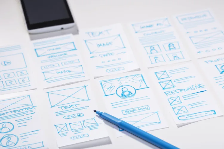
Every successful website, regardless of its uniqueness, shares certain fundamental elements. But what are they? In this article, we’re going to go over these essential habits that you can start using on your website.
These similarities encompass industry-specific terminology, page layouts, color schemes, and marketing strategies, which might surprise you. However, there’s a method to this apparent uniformity – it’s all about “conversion optimization”.
Studies like the well-known F-reading study, reveal that humans have specific patterns when scanning websites. In addition to the F-pattern, there’s also the Z-pattern reading. This study suggests that users often start at the top left corner (similar to F-pattern) and then move horizontally to the right before scanning down and moving to the left again, creating a Z-like pattern.
In essence, intentional design similarities among websites aim to create a user-friendly, efficient, and visually appealing online experience. While these websites might share common design elements, their uniqueness emerges from how these elements are combined and customized to convey the specific message and brand identity of their owners. It’s the same with home design.
Websites and Home Construction Share the Same Surprising Similarities
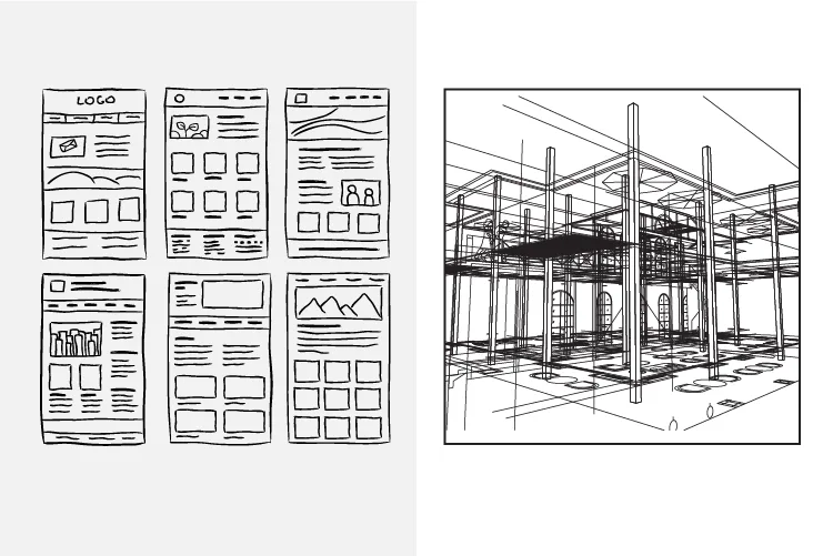
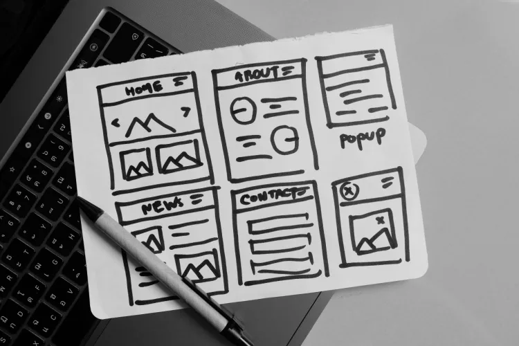
I often compare building a website to constructing a home because they share the same principles. Besides homes sharing the same fundamental elements, they both require meticulous planning and the use of blueprints. Just as a home begins with architectural blueprints and floor plans, a website commences with wireframes and design mockups. These serve as the foundational framework, providing a clear outline of how everything will come together. But, much like a well-constructed home, websites require the right materials, content, foundation, framework, design, aesthetics, and functionality.
In home construction, materials like bricks, wood, and concrete are thoughtfully selected for their strength and durability. Similarly, a website’s color scheme and typography are chosen to enhance its visual appeal and convey its message effectively. Just as a sturdy home requires a solid foundation for stability, a well-structured website framework is vital for ensuring seamless functionality and an excellent user experience (UX).
Just like homes need electricity and plumbing to work well, websites also need some key things to succeed online. Let’s dig into these 14 important elements that can make your website form great habits.
14 Essential Habits for a Great Website: A Blueprint for Success
1. Logo and Branding Elements
Your logo is the face of your brand, much like a home’s front door represents the entrance. Placing it prominently at the top of your website ensures instant brand recognition, just as a beautifully crafted door welcomes guests with your brand’s identity.
Consistency in design elements such as logos, color schemes, and typography is vital. It fosters a strong offline-to-online brand connection, reinforcing trust and reliability, similar to how the exterior aesthetics of a home contribute to its character and appeal. You are either showcasing your brand evolution or exposing it as superficial.
Asana does a really great job at this. You’ll also see their logo all over their website, in their chat app, and sometimes in text headers and call to action. Below is a nice call to action too, simple but buttons and text are prominent because it’s exactly the opposite color of the background.
2. Above the Fold Section (Hero Section):
The hero section acts as the initial impression on your website, much like a foyer in a house. Here, your mission statement and tagline create the first impression, setting the tone for the rest of the site. Think of it as a well-designed foyer that invites guests to explore further inside the house.
However, try to avoid using large hero images that hide important content below the fold.
See, above the fold and below the fold are old Newspaper publishing terms that crossed over to the web back in the 90’s. Content that was considered less important used to be put below the fold because, when displayed on a newsstand, it wasn’t immediately visible. But the most important bits where placed ABOVE the fold. If you do choose to have a full size hero for your homepage, make sure you have all the essential information above the fold.
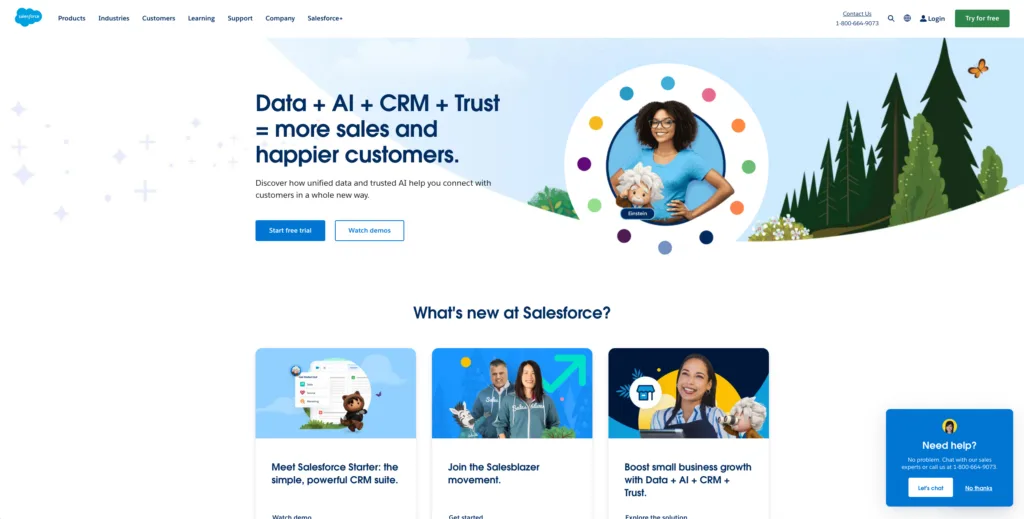
Salesforce shows how to use a hero image that is clean and saves space in the navigation bar with simple typography and all the essential information a customer needs to see above the fold.
3. Clear Messaging
One of the cornerstones of a successful website is clear messaging. Think of it as the blueprint that guides your visitors through your online home. Just as a well-constructed house has clear signage to direct you to different rooms, a website should have messaging that guides users seamlessly.
Clear messaging means that your website’s purpose, offerings, and mission are crystal clear from the moment a visitor lands on your homepage. It’s like having a welcome mat at your home’s entrance, inviting guests in and letting them know they’re in the right place.
Imagine walking into a beautifully designed home, but every room lacks signs or labels. You’d feel lost, right? The same happens when a website lacks clear messaging. Visitors quickly become disoriented, and they’re more likely to leave in search of a site that provides the information they need with ease.
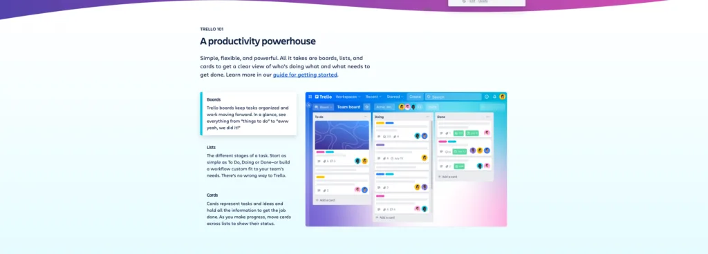
Check out how Trello does it. They are very specific and intentional with their messaging, making it seem like a breeze using their solutions. From “things to do” to “awww yeah, we did it!” is pretty clever.
4. Engaging Typography
Typography matters, just as the choice of materials and furnishings impacts the ambiance of a home. Clear and captivating fonts enhance content readability while contributing to the overall visual appeal of your site. I love sites like Type Hunting because you can find lots of font inspiration when coming up with new font ideas.
Just remember that people don’t read websites, they scan them. Keep your copy short, concise, and to the point, similar to the uncluttered and well-arranged spaces in a well-designed home.

5. Features, Benefits & Value Proposition:
Just as a well-constructed home showcases its features, benefits, and overall value, your website should do the same. Features describe what your website offers, such as user-friendly navigation or a range of products. Benefits explain how these features enhance the user experience, like making it easier for visitors to find what they need.
The value proposition ties it all together by explaining why your website is the best choice, just as a home’s value proposition might include its location, amenities, and price.
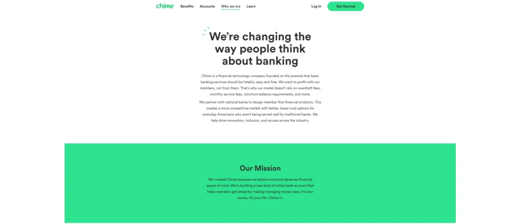
Take a look at how Chime does a great job on their about us page. Chime makes banking simple and free, avoiding traditional fees to create a user-friendly, cost-effective experience. Their focus on innovation and partnership with major banks offers practical, lower-cost financial solutions, aiming to give every customer financial peace of mind and a fairer banking system.
6. User Experience/User Familiarity
Just like people expect to find the oven in the kitchen or the bathtub in the bathroom, people are accustomed to certain web design conventions. That’s why UX design matters! Placing navigation menus at the top or side and logos in the upper-left corner creates a sense of familiarity. Also, users expect websites to behave in certain ways.
For instance, they anticipate that clicking a logo will take them to the homepage, and they understand that a search bar is for finding content within the site. Adhering to these conventions enhances user navigation and comprehension.
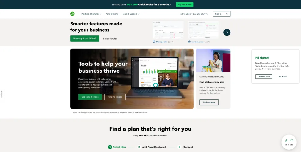
One of my favorite examples is Quickbooks. When you first land on their homepage, you can already see that their website has many of the essential elements we’ve talked about in this post. Take a look at the above the fold section on their homepage and you’ll see how they have a timestamp on their videos to manage bills and pay invoices on their sales video to easily find the information the user is looking for.
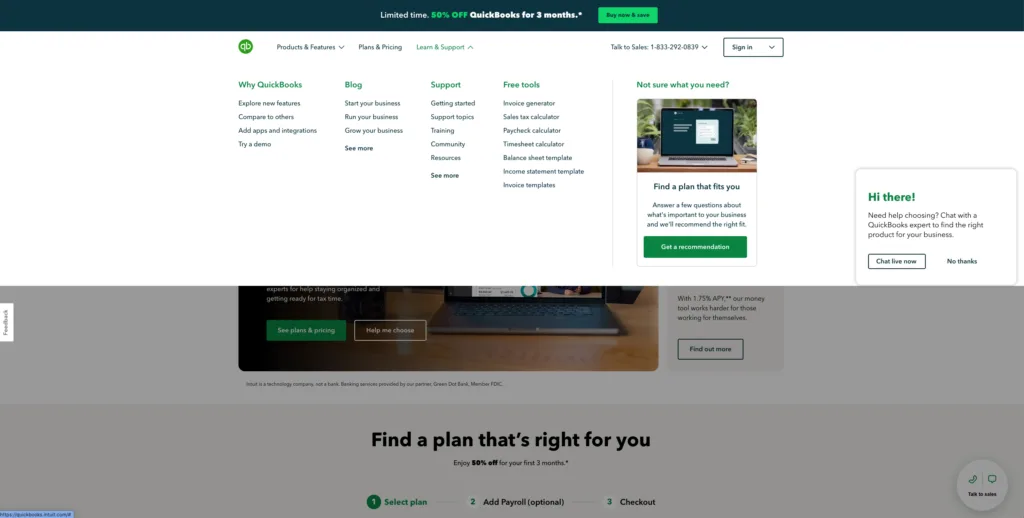
And when you look at their navigation menu, it is very organized and users can easily find what they are looking for.
7. Primary Calls-to-Action
Your site’s ‘Call to Action’ is like a friendly nudge saying, ‘Hey, don’t be a stranger, let’s chat more’ or ‘Ready to roll? Jump in here!’ These are your standout buttons or links that grab attention and make it super easy for visitors to know what to do next
Blinkist does a great job at this. Notice how it’s short but very effective and tells what the user will exactly get before signing up. More knowledge in less time, perfect for those that love to learn but don’t have the time…
Um, yes please.
8. Trust Building
Building trust and credibility on your website is essential. Just as a well-constructed home is a testament to its quality and reliability, your website must reassure visitors of its trustworthiness. Display authentic customer testimonials and reviews that serve as proof of your reliability and highlight the authentic voices of your customers, emphasizing the importance of authenticity.
Showcase the expertise and experience of your team, highlighting qualifications, certifications, and industry recognition to demonstrate your competence. Additionally, establish your authority in your field by showcasing your accomplishments and affiliations. Your website should highlight your industry authority. This comprehensive approach to trust building aligns with Google’s EEAT principles, reassuring visitors and strengthening your online reputation.
9. Content Quality
High-quality content not only attracts visitors but keeps them engaged and informed. Regularly updating your website with valuable, fresh content demonstrates authority in your industry and encourages repeat visits. Demonstrate your expertise by posting how-to articles. Curate content from your blog to create Youtube videos, shorts and IG reel content.
In industries where the customer lifecycle is extended, consistently publishing high-quality content becomes crucial. You never know when a potential customer might discover and engage with your material.
Hubspot does a great job at content creation. Hubspot does a terrific job at this and in my option, they are the best at it when it comes to inbound marketing.
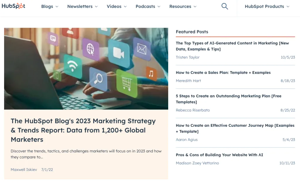
Aside from their blog, they are also great at creating different content types.
10. Supporting Images, Animations and Video
Visual content, including images, animations and videos, enriches the user experience. Did you know that video content is 52% more likely to be shared compared to other forms of content? Engaging visuals complement your message and capture visitors’ attention.
Have you ever thought about spicing up your site with some visuals? Including a couple of great images or even a video can really amp up your users’ experience. It’s like giving them a quick snapshot of what you’re all about. And let’s be honest, it’s way more fun to look at something cool or watch a short video than wade through a sea of text. Plus, it’s a great way to keep things interesting and make sure your message sticks.
I really like how Slack uses video on their homepage.
And to circle back to Asana, I really like these attention grabbing animations. It only animates when you scroll down, which is good as it does not distract readers and it is a nice representation of the app features.
11. Contact Information, Forms & Interaction
You have an awesome website, but how are they going to reach out to you. Do you have a form they need to fill out? A phone number to call? Facilitate easy communication with your audience through clear contact information and interactive features. Ensure your visitors can effortlessly connect with you by including dedicated contact details and a user-friendly contact page.
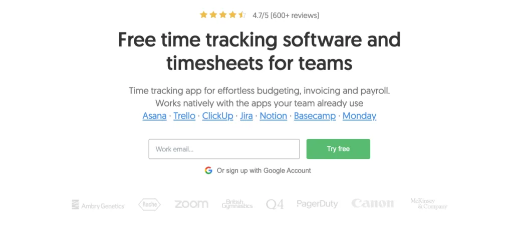
Additionally, offer various interaction options like contact forms, live chat, or social media links to engage and build relationships with your audience. Offers like a trade between email address and a free trial can work wonders. Notice how Everhour is including trust factors like star ratings and effortless use to increase the chances of signup.
12. Mobile Friendliness
I was having a conversation with a friend the other day about why web designers still promote mobile friendliness on their websites as a selling point. He feels it should be common place now that mobile friendliness is a part of web design and should be expected. Truth is, you’d be surprised with the lack of mobile optimized sites published on the web. I see it all the time when curating niche sites examples for clients.
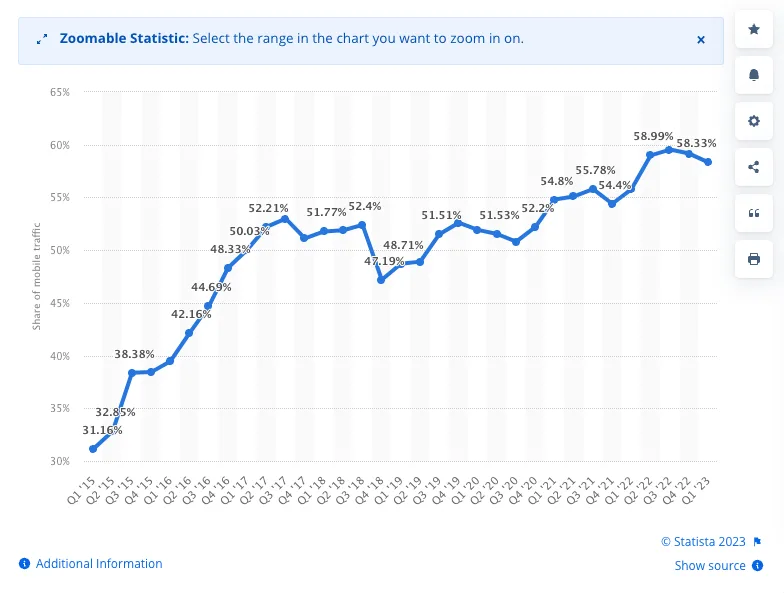
With so many people accessing websites on their phones and tablets, it’s vital to make sure your site looks and works great on these smaller screens. Being mobile-friendly isn’t just about user experience; search engines like Google also favor mobile-responsive sites. According to Statista, 58% of website traffic is comprised of mobile traffic so if you are thinking of a website redesign or launching a brand new site, go the mobile first design route.
13. Speedy Performance
Slow-loading websites can be a real source of frustration for your visitors. Ensuring that your site loads quickly is essential for keeping your audience engaged and satisfied. To achieve this, you can take several important steps to optimize your website’s performance. For instance, you can reduce image sizes to ensure they load swiftly, clean up and streamline the underlying code for efficiency, and make use of content delivery networks (CDNs) to supercharge your loading speed.
Not only does a fast-loading website provide an enhanced user experience, but it can also contribute to improved search engine rankings. This, in turn, can make your website more visible to a broader audience, helping you reach potential visitors and customers more effectively. So, prioritizing a swift loading time is not just about user satisfaction; it can significantly impact your site’s overall performance and success.
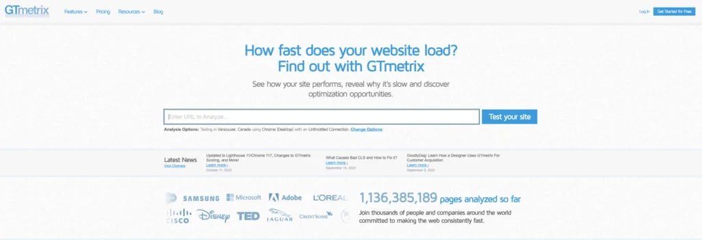
Google PageSpeedInsights is very helpful in finding key factors that could be slowing your site down with helpful tips to speed it up. We use a mix of PageSpeed Insights with GTMetrix because Google PageSpeed Insights uses headless/emulated browsers and GTMetrix loads your site using a real browser. So, even though both use Google Lighthouse, sometimes I find GTMetrix more accurate.

14. Security
Website security is like the locks on your home’s doors and windows. Just as you lock your doors to keep your home safe, securing your website keeps it safe from online threats.
Think of website security as setting up a security system. It’s about protecting your website from cyber risks, so it stays a safe place for your visitors.
Securing your website is crucial, much like securing your home. It ensures your website is safe, trustworthy, and reliable. Keeping your themes and plugins updated is similar to locking your doors to keep intruders out. It also shields your site from online threats and disruptions, much like protecting your home from bad weather and pests.
Make sure the web design company you work with is savvy with website security measures, don’t just assume they get it. A web design company like Neon Flamingo Creative has the experience and knowledge to keep your site safe, secure, and locked down from charlatans, thieves, and hackers so you can have peace of mind your website is in great hands.
Closing Thoughts
Think of your website as your digital home. Just like you’d want your physical house to be sturdy and inviting, your website needs these essential elements to make it strong and welcoming in the online world.
And just like your home needs regular maintenance and occasional upgrades, your website requires ongoing attention. Keep an eye on digital trends but don’t go chase them all. Make sure your site stays secure, efficient, and engaging.
Remember, your website isn’t just a place on the internet; it’s your online identity. It’s where you connect with your audience, showcase your brand, and conduct business. By incorporating these key elements, you’re setting the stage for a successful online presence. And if you want to spend more time on your business and not on your website, Neon Flamingo can help. Learn more about our web design pricing, or contact us today.


